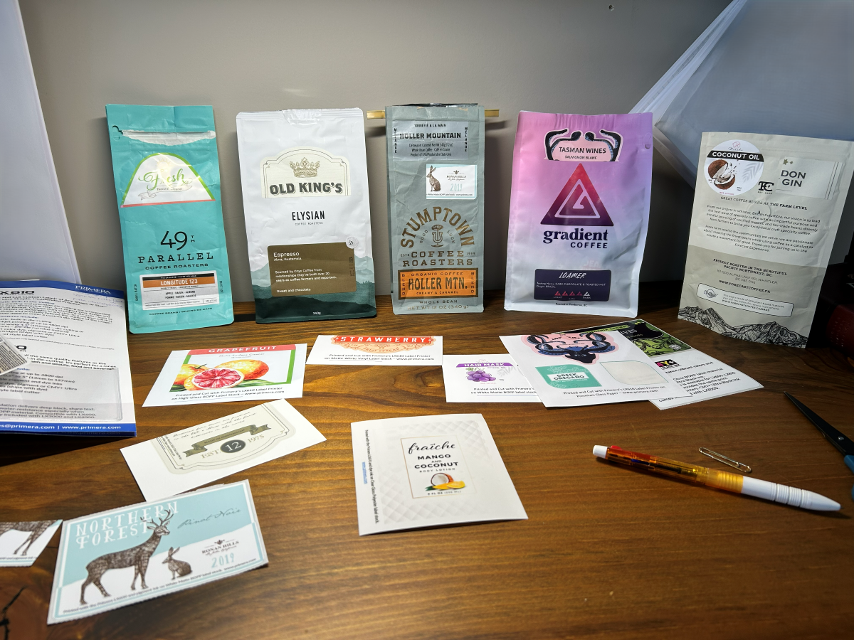
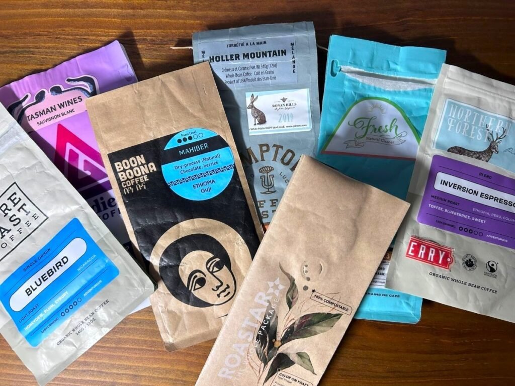
I have been collecting coffee bags for a while.
Some are fully printed. Some use large labels. Some look highly produced, while others are deliberately simple. I have put sample labels onto different bags, compared paper and synthetic label materials, looked at how colours behave on different surfaces, and sketched different ways the information might fit together.
At one point, I even went to a commercial printing supplier to see a label printer running in person.
At first, I thought I was trying to decide what the first Filgap coffee bag should look like.
The more I looked, the less that seemed like the right first question.
Before deciding what the bag looks like, I need to know what it has to do.
The bag has to work before it looks good
The first job is fairly obvious: protect the coffee.
Freshly roasted coffee continues to release carbon dioxide after roasting. At the same time, I want to limit its exposure to oxygen and moisture while someone is storing and using it. That is why I have been looking at bags with one-way degassing valves, reliable seals and enough barrier protection for the way I expect Filgap coffee to be sold and consumed.
For Filgap, though, I do not want to begin by asking how to keep coffee on a shelf for as long as technically possible.
That is not the business I am trying to build.
I want people around Squamish to buy coffee reasonably soon after it is roasted, drink it while it is fresh, and come back for fresh coffee again.
So the question becomes more specific: how much protection does the coffee actually need for the way Filgap intends to sell it?
I still want a one-way valve.
I also want a good zipper.
That preference is much less technical. I have used the older style of coffee bag where you roll the top down and close it with a tie. It works, but I find a zipper much easier.
Most people do not empty a coffee bag the day they open it. For many customers, the original package becomes the coffee’s storage container for the next week or two.
The same thinking applies to the shape. I am leaning toward a flat-bottom bag because it stands well, both at the market and at home.
A valve, zipper, tear notch, flat bottom and heat seal all sound like small details.
Together, they decide how useful the package actually is.
Small volume changes the design problem
The harder question for me is flexibility.
Eventually I would like Filgap to have a signature blend and a wider range of single-origin coffees. My original picture was one signature blend and perhaps six or seven single origins.
I do not think I need to begin there.
A Farmers’ Market table needs enough choice to be interesting, but every additional coffee creates another inventory to manage. If I begin with too many coffees before the sales volume is there, some of them may simply move too slowly.
That works against the freshness I am trying to protect.
Single-origin coffee changes naturally too. Coffee is an agricultural product. Crops change, lots change, and the coffee available to a small roaster one season may not be available in exactly the same way the next.
That is where fully printing a different bag for every coffee starts to worry me.
It can look very complete, but it also means committing to packaging inventory for a coffee that may change before all the bags are used.
At the other end is the simplest small-roaster approach: buy a stock bag and use a sticker or stamp.
There is nothing inherently wrong with that. It is flexible and keeps the commitment small.
But I do not want the first Filgap product to feel temporary simply because Filgap is small.
I am comfortable with a small production volume. I do not want “small” to mean that the part the customer holds feels unfinished.
The idea I keep coming back to is a common Filgap bag with a variable information layer.
The permanent part—the Filgap identity, basic visual language and information that does not change—could be professionally printed on the bag itself.
Then the coffee-specific information could change with a label.
If the bag and label are designed together properly, the label does not have to look like an afterthought.
That seems like one possible way to keep the operation flexible without making the product look temporary.
It is still a working direction, not a final decision.
The label question led me to another machine
Once I started thinking about labels, I found another rabbit hole.
I wanted to know whether labels printed in-house could actually look good enough.
So I requested samples.
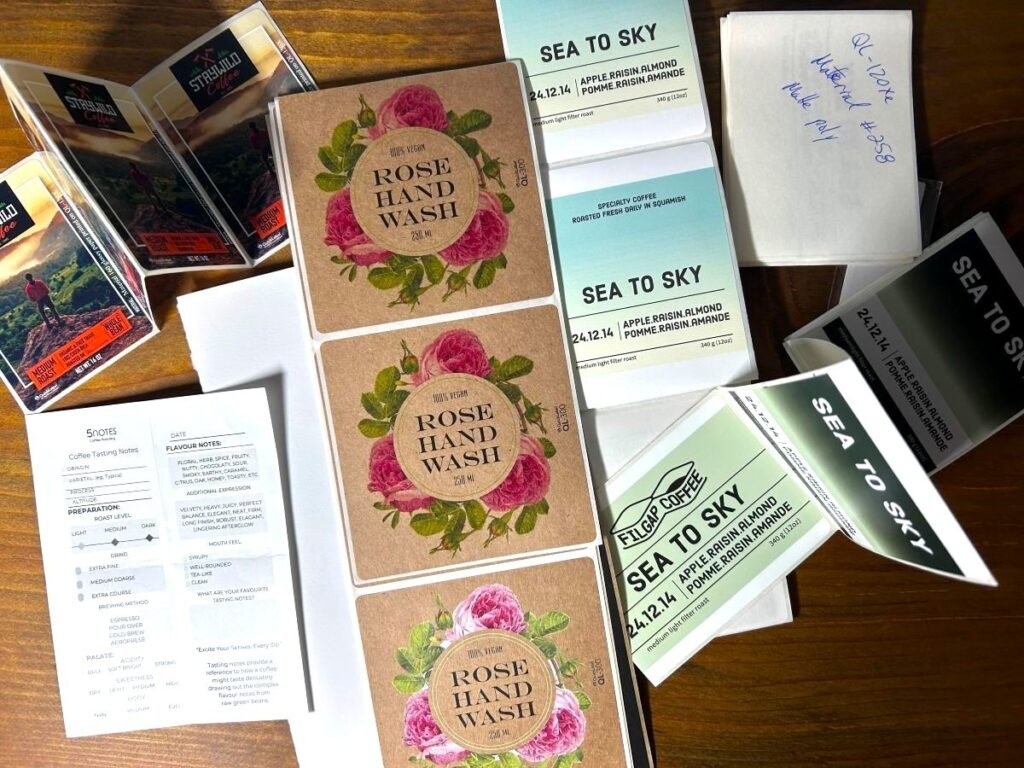
I compared different surfaces and print methods. I attached them to actual coffee bags instead of judging them loose on a desk, because the same label can feel quite different once it sits against kraft paper, matte film or a smoother surface.
Then I went to see a commercial colour-label printer being demonstrated.
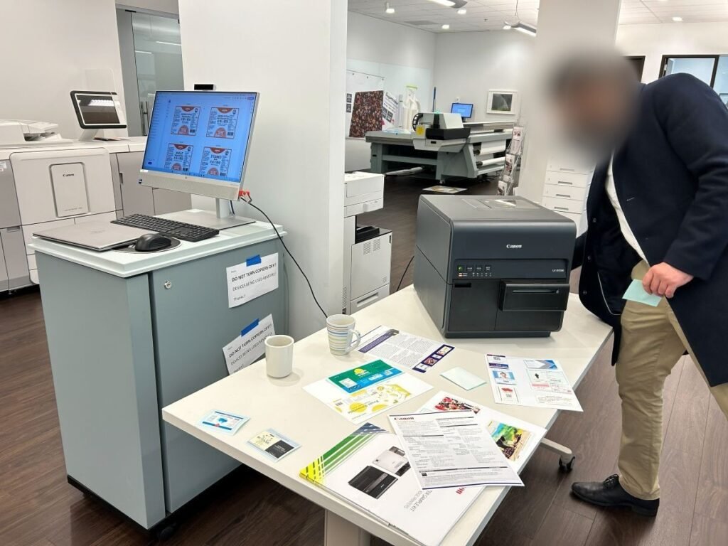
The attraction was obvious.
If a new single-origin coffee arrives and I only need forty labels, I could print forty.
If some information changes, I could change it immediately.
I would not have to guess several months in advance exactly how many labels each coffee will need.
That kind of flexibility has real value to a small roastery.
But the printer is another machine.
One commercial system I priced, including the printer, additional ink, media and support, came to more than CAD $3,000 before tax and freight.
Buying it is only the beginning. There is ink, maintenance, media, wasted prints, colour consistency and the time needed to operate another machine.
That made me question whether full-colour printing is actually the smartest way to solve the problem.
Another option is much simpler: have some of the colour and visual structure already produced on the label stock, then print only the information that changes in black.
That could mean coloured stock, a professionally preprinted label, or a thermal-transfer system.
I had originally been thinking mostly in terms of full-colour printer or outsourced labels.
Now I see more possibilities between those two.
That is useful, because I do not necessarily need the most impressive printer.
I need the simplest system that gives me the flexibility and finish I want.
Freshness should be easy to see
One detail I feel much more certain about is the roast date.
While looking through other coffee bags, I noticed that it is often something you have to find.
Sometimes it is near the top seal. Sometimes it is on the back. Sometimes it is small enough that you have to look twice.
Then I found a bag with ROAST DATE clearly presented on the front.
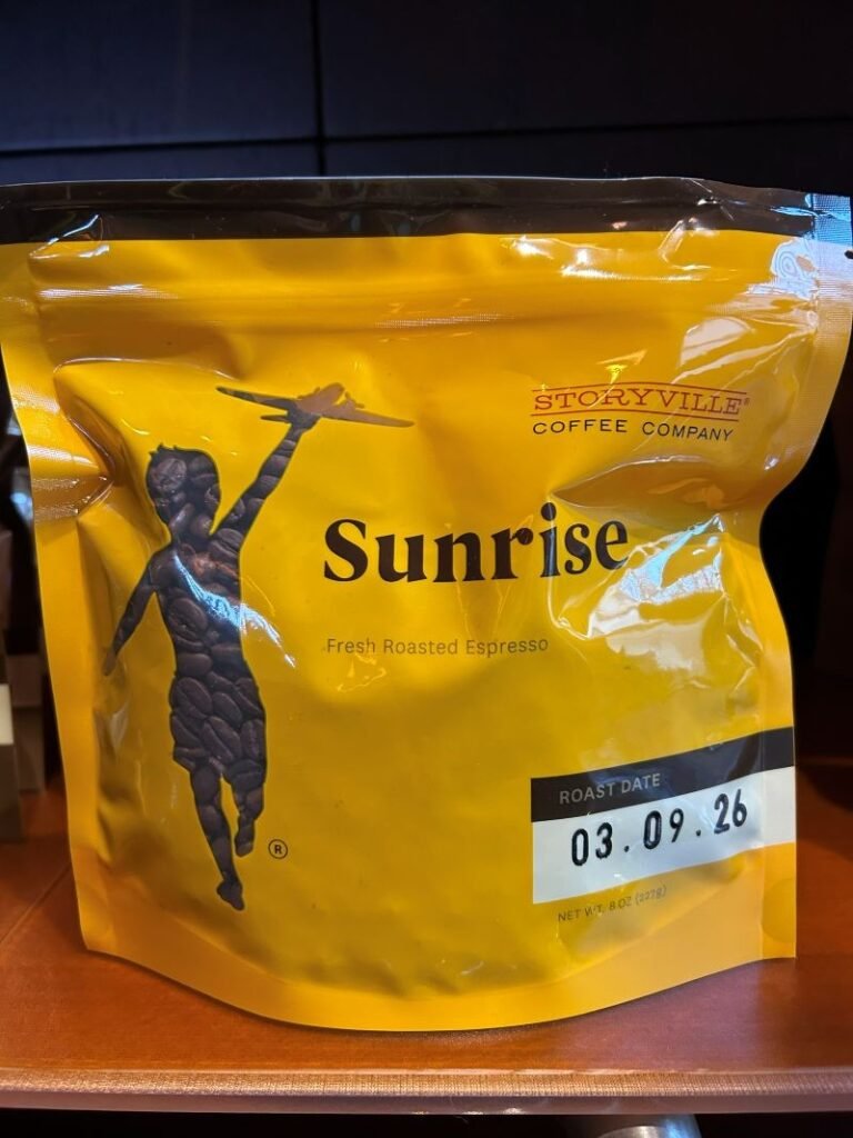
I liked that immediately.
Freshness is one of the things Filgap is trying to take seriously, so the roast date feels like information that deserves some visual priority.
That does not mean every technical detail belongs on the front.
There is a lot you could put on a specialty coffee package: origin, producer, process, variety, tasting notes, roast level, brewing suggestions, weight, required information and whatever else the brand wants to explain.
At some point, more information makes the bag harder to understand.
So I am becoming interested in hierarchy, not just content.
What should someone notice first?
What should be easy to find when they want it?
And what does not actually need to live on the bag?
That last question is where the Filgap website becomes useful.
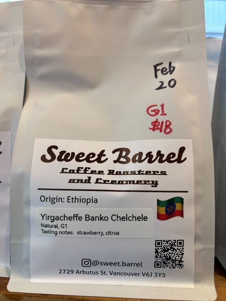
A QR code could connect someone to a fuller coffee story, brewing information, freshness guidance or disposal instructions without trying to turn the package into a small instruction manual.
“Recyclable” turned out to be a local question
The material question has been less straightforward.
I like some of the natural, kraft-like finishes used in coffee packaging. They can feel warm and appropriate for a small coffee brand.
But I do not want to choose a material based only on what looks environmentally responsible.
That became clear when I looked at what actually happens to packaging in Squamish.
Recycle BC accepts many plastic coffee pouches through its Flexible Plastics stream, including stand-up and zipper pouches. Coffee pouches that combine paper and plastic layers are not accepted there because those layers cannot be effectively separated. Packaging labelled biodegradable or compostable is also excluded from that stream.
In Squamish, flexible plastics do not go into the regular curbside recycling tote. Residents have to take them to a participating depot. Compostable or biodegradable plastic packaging also cannot go into the residential organics system and is directed to garbage.
That complicated my original idea of what an “environmentally better” bag might look like.
A brown package with a compostable claim may appear to be the obvious environmental choice, while a plastic pouch may not.
The local disposal system can tell a different story.
There is still an uncomfortable part I do not have an answer to.
A package can have a legitimate recycling route, but that does not mean I know how many customers will actually save it and make a separate trip to a depot.
I do not think putting the word recyclable on the bag solves that.
What I can do is understand the real pathway before I choose the material, and then explain it clearly.
That feels more useful to me than choosing the environmental message first.
I do not want to design only for the first market season
I started thinking about the sales channel early too.
Before Filgap reached this point, I contacted Vancouver Coastal Health and the District of Squamish to understand what a very small coffee business could actually do.
At the time, the guidance I received distinguished a Farmers’ Market-only pathway for the home-produced lower-risk products I had described from broader retail, online and direct sales, where different production requirements would apply.
That was useful for reasons beyond permits.
It reminded me that the first way I sell Filgap coffee may not be the only way I sell it later.
Food-labelling requirements can change with how and where a product is sold as well. Consumer prepackaged foods in Canada generally require mandatory information in English and French, while a specific local-food exemption can apply when its geographic and language conditions are met.
I still need to reconfirm the current requirements before the actual launch.
But I do not want to design the physical package so narrowly that the whole system has to be discarded when Filgap moves into another stage.
That may mean leaving room for information I do not need immediately.
It may mean keeping some information on the permanent bag and some on the variable label.
A retail barcode is another example. I may not need one at the first Farmers’ Market, but I can still think about where it would go later.
This is why I have been sketching the front, back and label together.
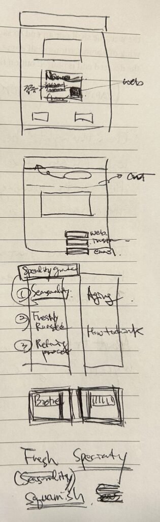
The logo is only one of the things that has to fit.
Where I am now
I still have not chosen the first Filgap coffee bag.
I have not decided the exact bag size either. Something around the common specialty-coffee sizes may make sense, but I want to look at household consumption, price, roast yield and how quickly I expect customers to finish a bag before choosing it.
The material is still open.
So is the exact barrier specification.
I still have to decide whether the variable information is best produced with outsourced labels, an in-house colour printer, a simpler thermal system, or some combination of those ideas.
Large preorder bags may need a different solution altogether. For very small quantities, trying to force the retail packaging system onto them may create more waste than it solves.
But I am much clearer about what I am trying to build.
The package needs to protect the coffee for the way Filgap actually sells it.
It needs to be easy to use at home.
Freshness should be visible.
The identity should feel finished.
The coffee-specific information needs to stay flexible.
And I want to know what happens to the bag in Squamish after the coffee is gone.
That is a lot of responsibility for something that looks, at first, like a bag.
The design will come.
For now, I think I am finally getting closer to understanding the brief.