If I imagine somebody walking into a future Filgap space, the first thing I think about is not the furniture.
It is whether anybody notices them.
That sounds very basic, but I think it matters more than a lot of design decisions.
Someone comes through the door. They look around. Maybe they have never been there before. Maybe they know a lot about coffee, maybe almost nothing.
I want somebody working there to make eye contact.
A greeting is enough.
It does not need to be loud or enthusiastic. Some people are quiet and would probably prefer not to have too much attention placed on them.
What matters is that the customer knows we noticed them.
I have been in places where the staff are busy, everyone is focused on their own work, and you can stand there for a while feeling almost invisible.
I do not want that.
If the first ten seconds of the room tell someone, “You can be here,” then a lot of the rest becomes easier.
I notice the whole feeling before I notice the design
When a coffee space feels good to me, I usually cannot explain it with one thing.
It is not just that the furniture is beautiful.
The temperature is comfortable. The room is clean. Things are in their place. The staff seem aware of what is happening. The lighting is right for the time of day. There is enough room around me that I do not feel squeezed between other people.
Sometimes none of those things is especially impressive by itself.
But together they make me want to sit down and have coffee.
I have also been in attractive places where I did not want to stay very long.
One reason is crowding.
If the tables are too close, or if the room is so busy that I feel I have no small area of my own, conversation becomes harder. I am not talking about needing privacy in a café. I just like enough space that two people can sit together without feeling as though everyone beside them is part of the same conversation.
In a very busy tourist location, maybe that is unavoidable.
For the kind of place I imagine for Filgap, I would prefer not to begin with that assumption.
I like a room with people in it.
I just do not want the room to feel as though the people have overwhelmed it.
The room should have some energy
I would not want Filgap to feel like a reading room where everybody is afraid to speak.
People should talk.
There should be some music.
Coffee is being made, staff are moving, people are meeting.
That activity is part of what makes a coffee place enjoyable.
I probably prefer mornings a little calmer myself, but even that depends on the location.
If the future space is somewhere people pass on their way to work, maybe the morning needs a little more life. The music could have more energy. Later in the day, I can imagine things settling down.
Lighting can follow that too.
I like natural light. If artificial lighting can change a little as the outside light changes, I think that would help the room feel more comfortable.
I do not mean some elaborate lighting performance.
Just not the exact same bright room from early morning until late afternoon.
Sound is more difficult.
Music and noise are not the same thing to me.
A bit of background music can support the room. Grinding coffee, dishes, an espresso machine and people talking can very quickly become something else.
Even knocking out espresso pucks can be surprisingly loud if you hear it every few seconds.
There are technical ways to reduce some of that now, and I think they are worth considering.
The roaster will be another question because a roaster is not quiet either. I want to deal with that separately because I also want the roasting work to be visible in some way.
For this article, the point is simpler.
If the customer has to raise their voice to talk to the person across the table, I think the room has gone too far in the wrong direction.
I do not imagine people staying for three hours
There will be takeaway customers.
There will be people who come alone and sit quietly.
I am fine with that.
But when I picture the future tasting room, the use I imagine most often is two people meeting, sometimes three, having coffee and talking for a while.
Maybe thirty minutes.
Maybe an hour.
I do not think I need to put a time limit on that.
I just do not want to design the whole space around someone settling into one table for half a day.
Part of that is business, of course. Seats need to turn over at some point.
But it is also about the kind of room I want.
If one large group takes over a section and becomes very loud, other people feel it.
If every table becomes a workstation, that changes the room too.
I am not trying to stop either of those things from ever happening.
I just would not design for them first.
Cleanliness is more than whether the table was wiped
I care a lot about cleanliness.
Probably more than some customers will consciously notice.
For me, there are a few things that make a food-and-beverage space feel clean.
Water is one.
If the counter or floor around a work area is always wet, it does not feel clean to me even if somebody has technically sanitized it.
Smell is another.
Then sound.
This may sound strange because sound is not hygiene in the usual sense, but unnecessary banging and operational noise can make a place feel uncontrolled.
When the equipment, water, smells and work areas are being managed properly, the room feels more organised.
I am naturally quite good at that side.
I like putting things in order. I think about efficiency. I notice where equipment should go and how people should move.
The part I am less confident about is making all that order feel comfortable.
There is a danger for me here.
If I design everything only around neatness and efficiency, the space could become too rigid.
Customers should not walk in and feel as if they are entering somewhere they are afraid to touch anything.
That would be the opposite of hospitality.
I think this is one area where I may eventually need help from a good designer.
I know quite clearly what I want operationally.
Translating that into a room that still feels warm may not be something I should assume I can do by myself.
The menu and the bar can make people nervous too
A customer can feel unwelcome even when the staff are friendly if the room is difficult to understand.
The menu is one example.
When I look at a menu, I want to be able to understand the basic structure without having to ask what every word means.
That does not mean coffee has to be simplified until there is nothing interesting left.
It just means there should be a logic.
If milk drinks are arranged in a way that helps people understand the difference, good.
If the categories are clear, good.
I know there are menu-design theories about putting certain prices in certain places or using comparison psychology.
Those things may matter.
My first concern is more basic.
Can the customer look at it and understand what we sell?
I consider that a form of kindness.
I think the physical space should work the same way.
- Where do you order?
- Where do you stand while waiting?
- Where are the coffee bags?
- If someone stops in front of the whole-bean display because they are interested in one of the coffees, can a person behind the bar easily come over and talk to them?
That last part matters to me because Filgap is supposed to sell coffee, not only cups of coffee.
I do not want the beans placed somewhere beautiful but disconnected from the people who can explain them.
If somebody is looking at a bag and has a question, the layout should make the conversation easy.
I keep thinking about the height of the bar
This is a fairly small detail, but I think it changes the way people interact.
From the operator’s side, a high counter is convenient.
There is always something behind a coffee bar that you would rather the customer not see.
Tools, containers, cables, towels, small pieces of equipment.
Raise the front of the bar and a lot of that disappears.
But the person disappears a little too.
If the counter comes up high on the body, the customer and staff member are talking over a barrier.
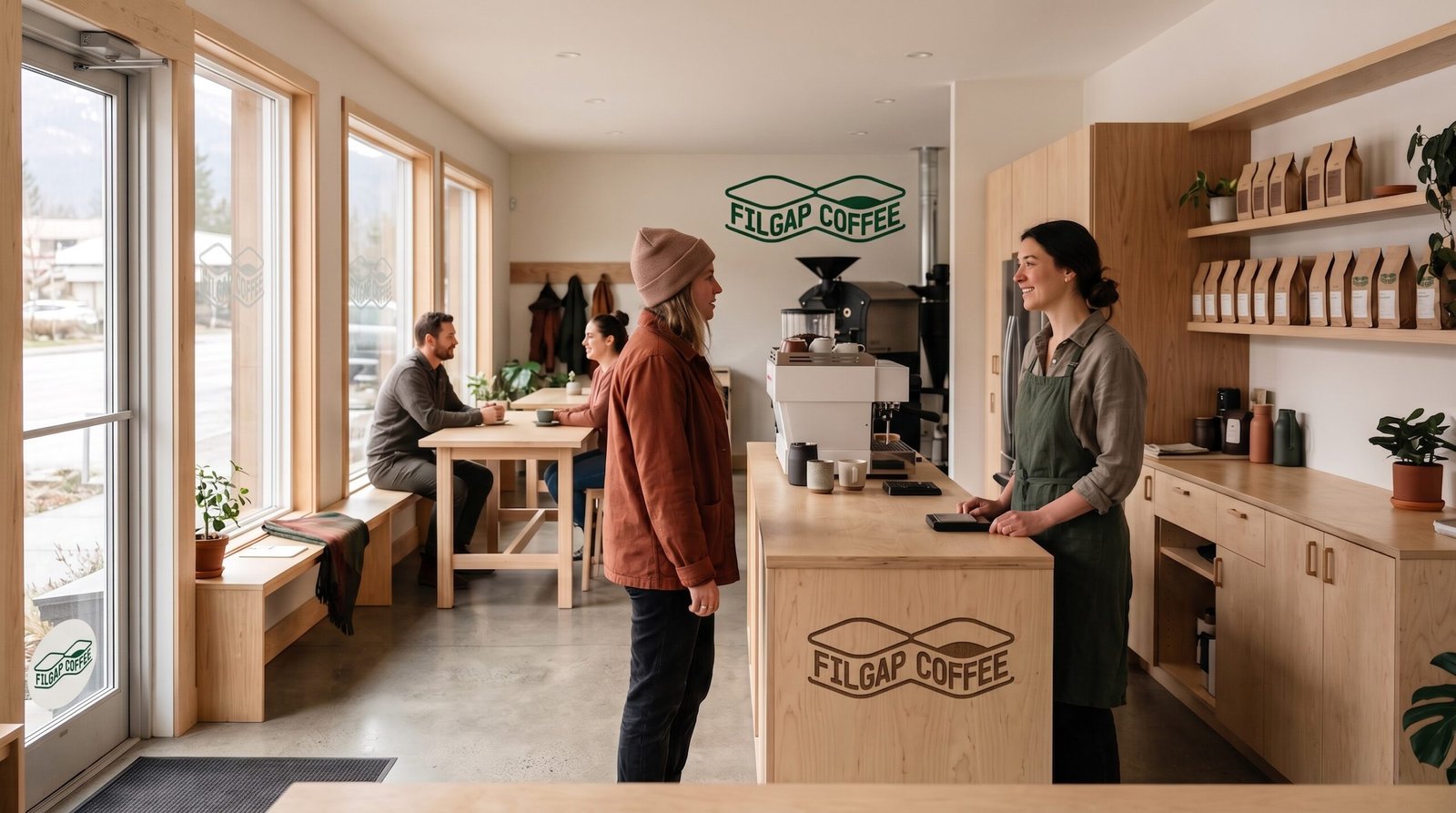
I prefer the idea of the counter being lower, maybe closer to waist height where practical.
Then more of the person is visible.
The conversation feels more open to me.
Of course, that creates a problem on the inside.
Now I cannot hide the operation.
The things behind the counter actually have to be organised.
I think I would accept that trade-off.
If I want the customer side to feel open, I probably have to do the harder work behind the bar rather than simply cover it.
This is not a final construction decision. I do not know the exact height or layout yet.
It is more about what I want the relationship across the bar to feel like.
Squamish should be there, but quietly
I still like natural materials for Filgap.
Wood makes sense.
Green makes sense.
Earth colours, lighter colours, natural light.
Those things already connect with the brand, and they are also colours I see around Squamish.
Forest.
Water.
Soil.
Snow.
Mountains.
Even the Filgap logo has some of that thinking behind it, although it is not a literal picture of a mountain and lake.
I would like the space to work in a similar way.
I do not want to put photographs of the Chief everywhere and call that local design.
I do not think hanging climbing equipment or skis on the wall automatically makes something feel like Squamish either.
It can become decoration very quickly.
Logging history is interesting to me because it is actually part of the place.
Maybe timber could refer to that history.
But even then, I would not want the room to become a rustic cabin.
I remember looking at a concept image for the earlier DREAM article where the material was clearly a log, but the outside had been stripped and finished.
It was still timber.
It just looked more controlled.
That is closer to what I imagine.
There may be better ways to express Squamish later. I am not trying to finish that decision now.
I mainly know that I would rather people feel the connection than have the room explain it to them with signs.
Five words are enough for now
When I try to describe the future room in five words, I end up with:
Welcoming. Calm. Natural. Precise. Alive.
I did not plan those five in advance, but I still like them.
Some of them are easy for me.
Precise is easy.
Clean and organised are close to how I naturally work.
Welcoming is something I care about strongly.
The harder part is getting all five into the same room.
A very precise room can become cold.
A very natural room can become more rustic than I want.
A very lively room can become noisy.
And if I concentrate only on calm, maybe nothing is happening.
That balance is probably more useful to me at this stage than deciding whether the interior should be called Scandinavian, modern, industrial or something else.
Those style words can come later.
There are some things I already know I would avoid.
I do not want luxury for the sake of luxury.
I do not want the room to feel corporate.
I do not want it to feel precious, as if everything has been arranged for a photograph.
I definitely do not want it dirty or messy.
And I do not want it to feel difficult.
That last one may be the most important.
Someone should be able to walk in, understand where to go, order a coffee, ask a question if they have one, sit down and have a conversation without feeling that they first need to understand the culture of the place.
That is probably the experience I want to design before I choose the chair.