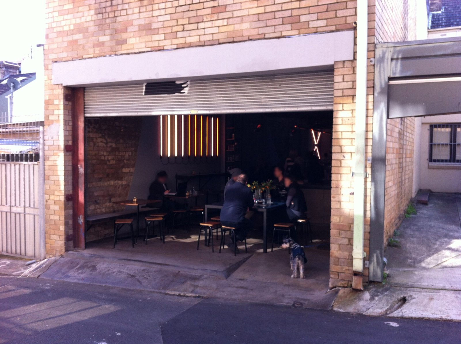
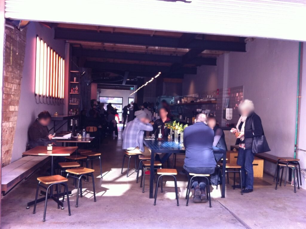
I took these photographs at Reuben Hills in 2012.
Looking through them again now, I noticed something about the photographs themselves. I did not only photograph the room. I took close-ups of a tiled table, the steel frame under a bench, concrete blocks around the coffee bar, and even a bathroom wall where old tiles and stripped surfaces were still visible.
Apparently, those details already interested me.
More than a decade later, I am looking at them for a different reason.
As I think about the kind of physical space Filgap Coffee may eventually need in Squamish, BC, Canada, I keep coming back to a practical question. Does a future roastery and tasting space necessarily have to begin with a conventional retail storefront?
Downtown has obvious advantages. But Squamish also has commercial and light-industrial areas with larger, more utilitarian spaces. Some of those buildings do not immediately look like places where I would imagine sitting down with coffee.
That is what brought Reuben Hills back to mind.
Not because I want to reproduce it, but because it made me look differently at what an existing building already has.
Field visit: 2012
Location: Reuben Hills, Surry Hills, Sydney, Australia
Research focus: Adaptive reuse, interior materials and selective finishing
This article is based on photographs and observations from my visit in 2012. The café and its operations may have changed since then. Current factual details were checked separately where relevant.
A café inside a former printing factory
The building gives quite different impressions depending on where you approach it.
One side feels relatively familiar: signage, windows and the scale of a neighbourhood business. The large roller-door opening tells a different story. From there, the depth of the building and its industrial character are much easier to read.


That makes more sense once you know what the building was.
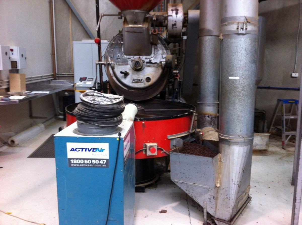
A contemporary architectural record describes Reuben Hills as a conversion of a former printing factory. The long, narrow site stretches between two parallel streets. The café occupied the ground level, while the original 2012 project placed coffee grinding and roasting, a production office and a cupping area above.
I remember the roastery being upstairs when I visited.
What interested me was that becoming a café had not required the building to stop looking industrial.
Much of the old structure was still allowed to explain itself.
The building was not hidden
There is a lot of exposed brick in these photographs.
The concrete floor still looks like concrete. Structural elements remain visible. In several places, the meeting point between the old building and the new work is quite obvious.

That was not simply because the renovation stopped halfway.
The original project documentation records existing plaster being selectively removed to expose sections of brickwork. The existing ground-floor concrete floor was refinished and sealed rather than concealed beneath a completely new flooring system.
Looking at it now, I think selectively finished describes the approach better than unfinished.
Some surfaces were changed.
Some were repaired.
Some new elements were inserted quite precisely.
And some old surfaces were simply allowed to stay visible.
That difference matters. Leaving something alone can also be a design decision.
I kept seeing the same few materials
This is probably what I find most interesting in the photographs today.
There really are not that many materials.
Steel. Tile. Timber. Concrete. Concrete block. Existing brick.
Then they repeat.
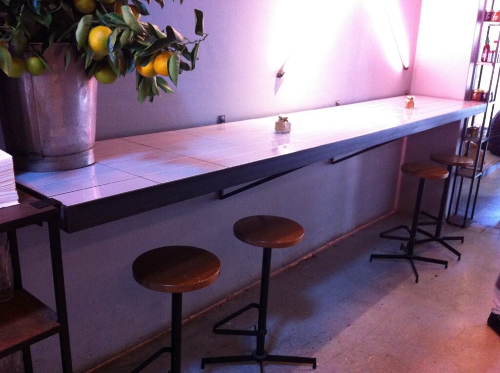
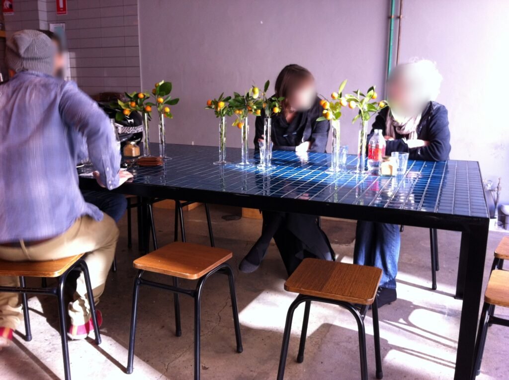
A tiled counter sits on a simple steel structure with timber stools underneath. A smaller table uses a similar combination.

The communal table does it again at a larger scale.
The wall bench makes its steel support visible.
At the coffee bar, concrete block is not hidden behind another decorative surface. It becomes the surface.
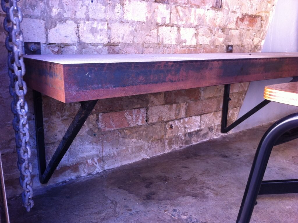
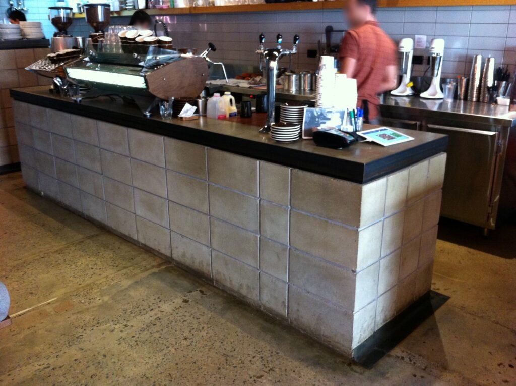
The architectural specifications from the time confirm much of what the photographs show: exposed existing brick, refinished concrete flooring, concrete blockwork, steel details, timber veneer, stainless steel and tiled surfaces were all part of the project.
What stayed with me was not one particularly luxurious material.
It was how few materials were doing so many jobs.
I find that useful because café interiors can easily become a collection of separate ideas: one material for the bar, another for tables, another wall treatment, another feature finish.
Reuben Hills makes me ask a simpler question.
Does every part of a café need a new material idea?
Maybe not.
Even the bathroom kept the scars
The bathroom is probably the clearest example of why I took these photographs.
Parts of the tile remain. Other sections appear to have been stripped away. Brick and rough wall surfaces are exposed rather than reconstructed until the previous condition disappears.
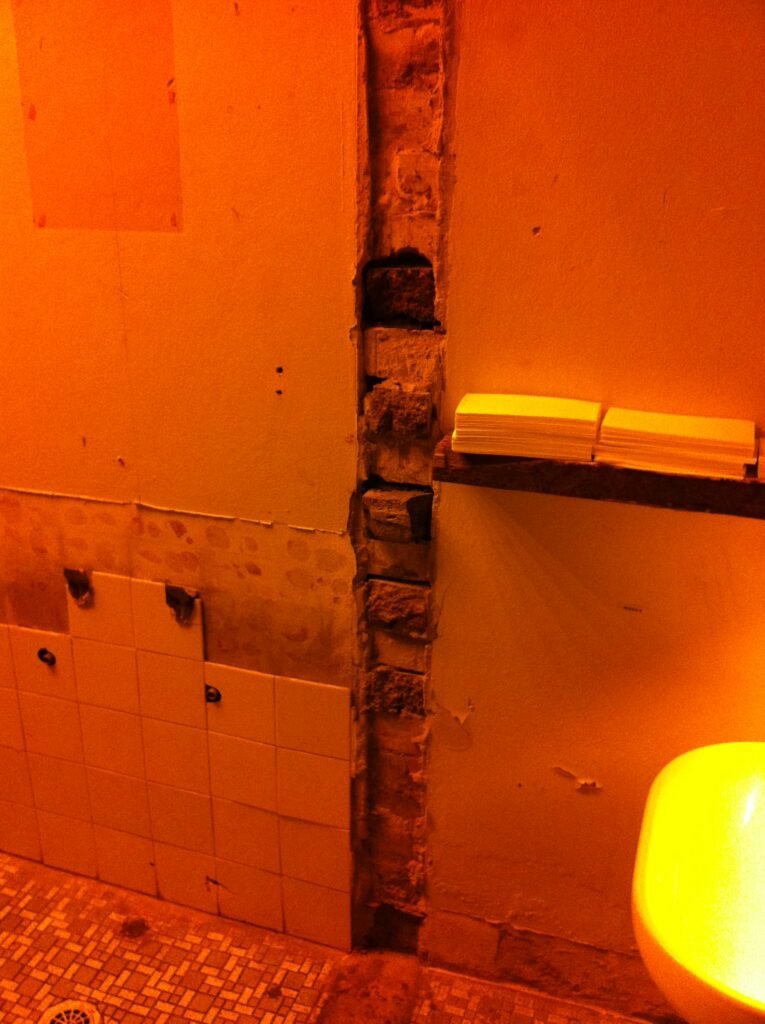
And then the lighting changes the whole thing.
The project specifications are unusually helpful here. They record that the existing ground-floor bathroom tiled floor was retained and treated, while areas where walls had been removed were patched in concrete and sealed.
I remember looking at this as a practical idea.
Why rebuild every surface just to make the previous building invisible?
But there is a catch.
There is a difference between not finishing something and deciding that another finish is unnecessary.
The first can simply look neglected. The second only works when everything around it makes that choice feel deliberate.
My first thought was: this could save money
That was genuinely one of my reactions when I went back through the photographs.
If you keep an existing concrete floor, expose brick instead of covering it and use straightforward materials such as block, tile and steel, surely there is an opportunity to control some fit-out costs.
I still think that question is worth asking.
But I would stop there.
I do not know what Reuben Hills actually cost to build, and these photographs cannot tell me.
They do not show the cost of electrical work, plumbing, ventilation, structural modifications or fire protection. They tell me nothing about permitting or accessibility work. Even simple-looking custom furniture still has to be designed, fabricated and installed.
So I would not use Reuben Hills as evidence that an industrial-style café is cheap.
The lesson is narrower and more useful:
An old surface does not automatically need a new surface on top of it.
That can reduce unnecessary work.
It does not make the rest of a commercial fit-out inexpensive.
The roughness was not really the design
There is another reason simply copying the exposed-brick-and-concrete look would miss the point.
Step away from the detail photographs and look at the whole room.
The furniture relates to each other. Materials repeat. Natural light reaches deep into the space. Lighting has been placed deliberately against surfaces that otherwise could feel quite cold.
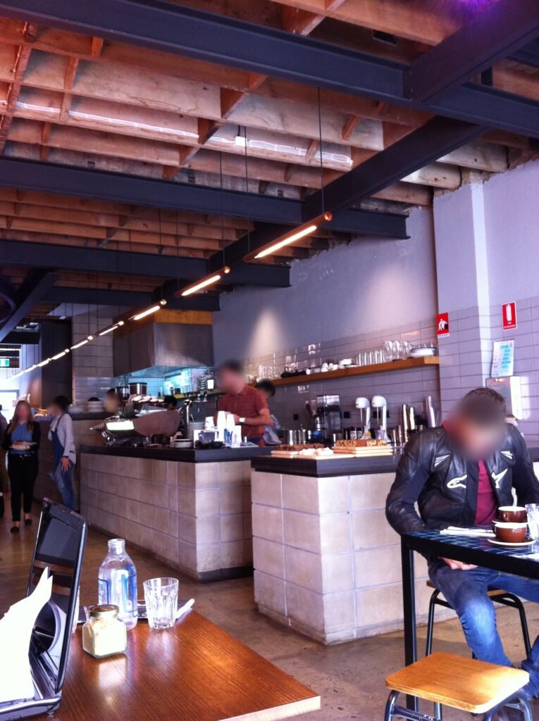
The contemporary architectural review similarly describes a deliberately limited industrial material palette, while noting the warming effect of natural light and feature lighting.
So I do not think the roughness itself was the design.
The decisions around the roughness were.
That is harder to copy.
And probably more useful to study.
Why this matters to me in Squamish
I am not searching Squamish for a building that looks like Reuben Hills.
I also do not know whether a business-park or light-industrial-type unit will ultimately make sense for a future Filgap roastery and tasting space. That depends on things I have not proven yet: location, customer behaviour, permitted use, construction requirements and, eventually, the economics.
But Reuben Hills gives me a different way to walk through those spaces.
Instead of immediately seeing a concrete floor that needs to be covered, I can ask whether it really does.
Instead of seeing an old wall that needs to disappear, I can ask whether it has something worth keeping.
Instead of assuming that a utilitarian building has to be transformed until nobody can tell what it used to be, I can ask what happens if part of that character remains.
That is quite different from deciding that “industrial” should become Filgap Coffee’s interior style.
I am more interested in the underlying question than the style.
What actually needs to change?
Four questions I would take with me
If I were walking through a possible future coffee space now, these are the questions I would want to ask before deciding what to rebuild:
What already has character and does not need to be covered?
Which surfaces actually need new finishes for durability, cleanliness, safety or function?
Could a small number of materials solve several problems instead of introducing a new finish each time?
Where would the budget matter more if it were spent on function rather than decoration?
Those questions would not design the space for me.
But they might stop me from treating a useful building as a blank box.
A good room is still only part of a café
There is one last correction to my own thinking.
These photographs naturally make me focus on the room because that is what I was photographing.
But a room is not enough.
Coffee still has to be worth coming back for. Food has to work if food is part of the business. Service matters. Hospitality matters. The operation behind everything has to make sense.
An interesting interior cannot substitute for those things.
So the lesson I take from Reuben Hills is actually quite small.
An old industrial building did not have to stop looking like an old industrial building before it could become a place where people wanted to spend time.
That is what I want to remember when I look at possible spaces in Squamish.
Not only what should be changed, but what might already be worth keeping.
Research notes and sources
Reuben Hills states that its Surry Hills café has operated since 2012 at 61 Albion Street. The company currently roasts coffee in Marrickville.
Historical building and design details in this article come from ArchitectureAU’s November 2012 project record, which identifies the space as a former printing factory and documents its original layout, materials and interior treatment.