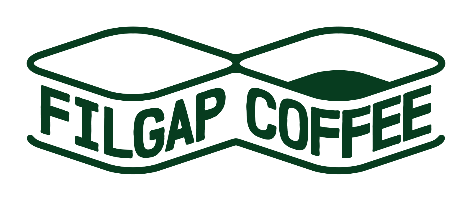
The Filgap logo is already on the website and our social channels.
What I haven’t really explained yet is why it looks the way it does.
The logo was not the starting point.
Before the designer and I began drawing anything, there was already a business plan, a name and a basic idea of what Filgap Coffee was supposed to do.
The first practical gap I wanted to address was simple: make freshly roasted specialty coffee easier to get locally in Squamish.
The name came from “fill the gap.”
And I wanted the logo to carry that idea somehow, not just look like a coffee logo.
Before there was a mark
When we started working together, I gave the designer the business plan and we began with the ideas behind the business.
We talked every week.
We kept asking what “fill the gap” might look like if you had to turn it into a shape.
I kept coming back to two images.
One was a cup that was only partly full. There was still space above it, waiting to be filled.
The other was a bridge with a section missing in the middle. The gap was something that had to be connected.
Those were not literal logo ideas.
They were ways of thinking.
At the same time, the mark had to do two other jobs.
Filgap does not immediately tell you what kind of company it is. That is partly intentional. Even the spelling removes one of the l’s from “fill,” leaving a small layer of curiosity in the name.
But I did not want the logo to be so mysterious that people could not tell what we do.
I wanted COFFEE to be clear.
And because this company is starting in Squamish, I wanted some sense of this place in it too.
Then we started drawing.
More sketches than I expected
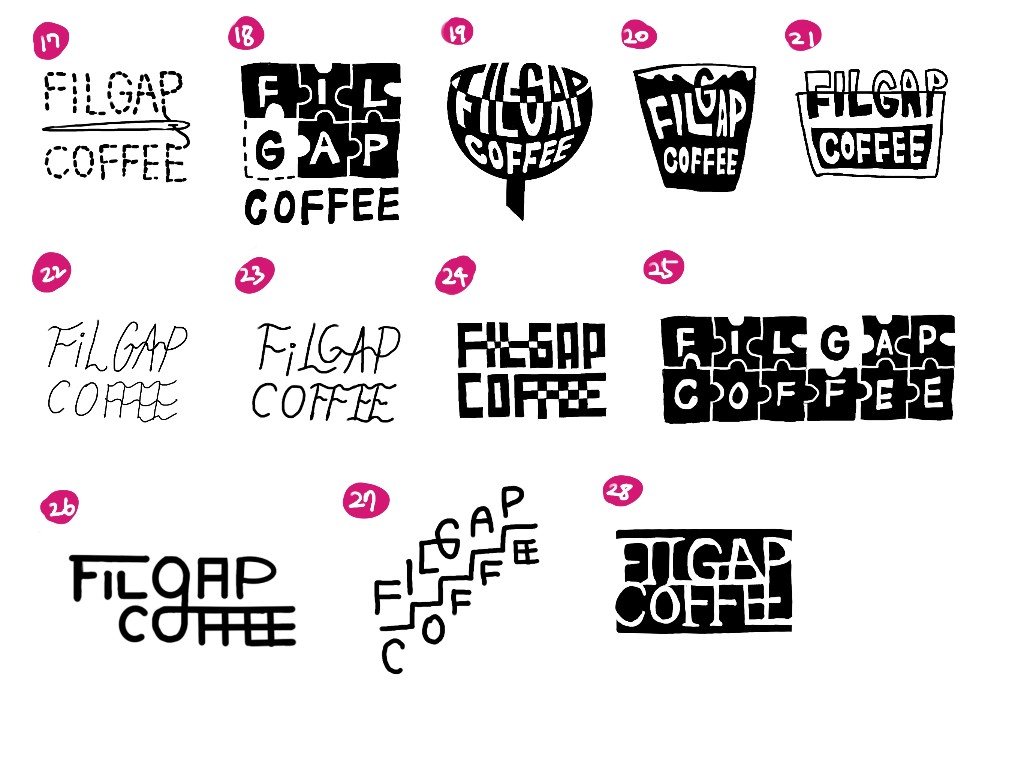
Looking back at the development files now, there are dozens and dozens of sketches — probably more than seventy — followed by more rounds of refinement.
Some ideas were based mainly on words. Some looked more like containers. Some used puzzle-like pieces or blocks. Others tried to show the idea of a gap much more directly.
Most of them went nowhere.
But that was useful.
We were not simply trying to choose the most attractive sketch from a page.
We were trying to find a form that could hold three things at once: the idea of filling a gap, coffee, and Squamish.
At some point, a diamond-like shape began to feel right.
It was still only one shape at first.
Then I went back to the other part of the idea: connection.
If a gap can be filled, it can also be bridged.
That led us toward two forms joined in the middle.
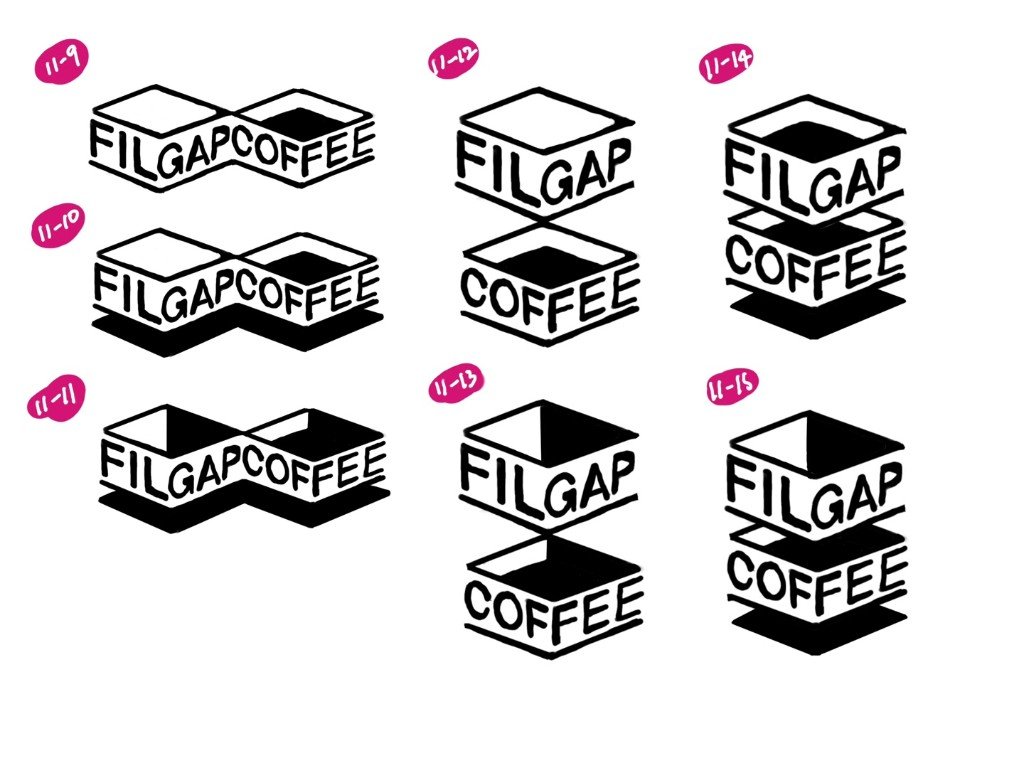
The earlier versions were harder and more geometric.
Over time the lines softened. The proportions changed. The lettering changed.
The mark slowly became the one we use now.
Filled, connected, and still open
In the finished symbol, the two forms are already connected.
That matters to me.
In my mind, one side represents something that has been filled, while the other still leaves space open.
Something has been done, but something is still waiting.

That is probably the most direct visual expression of the name.
Filgap began with one practical gap I could see for myself.
I wanted freshly roasted specialty coffee that suited the kind of coffee I enjoy, and I wanted to be able to get it locally without making a special trip.
But I never wanted the name to mean that freshness was the only gap Filgap could ever think about.
The larger question behind the name is still there:
What gap can we genuinely help fill?
So I like that the symbol does not suggest that everything is already full.
There is still room.
Squamish without drawing a mountain
There was one more problem.
I wanted the logo to feel connected to Squamish, but I did not want to put a coffee bean, a cup or a literal mountain into it.
There is nothing wrong with those symbols.
They just felt too direct for Filgap.
Around the Sea to Sky, mountains and nature appear in many local identities. I wanted ours to carry something of the place without simply drawing the obvious thing.
While we were developing the geometric form, I kept thinking about the view over Howe Sound from the Sea to Sky Gondola.
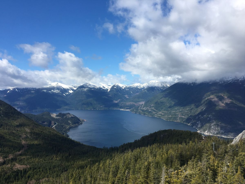
The shape did not come from tracing that landscape.
But once the form began to settle, I could see something of Squamish in it.
The rises could suggest mountains. The open forms could suggest water. Together, they reminded me of the way land, water and sky meet here.
I liked that you did not have to see that immediately.
It could simply be a shape first.
Then, if you knew the story, you might see a little more.
Why forest green
The colour came later.
I have always liked green, but I did not choose forest green only because I liked it.
It is the colour I notice most around Squamish.
Trees are everywhere.
Around them are earth and wood, water and sky, and in winter, snow on the mountains.
Those became the broader visual palette I wanted around Filgap.
Forest green became the main colour because it felt like the most natural place to start.
I don’t expect the logo to explain itself
I do not expect someone to look at the Filgap logo for the first time and understand everything I have just described.
That was never the goal.
If someone sees COFFEE and understands what kind of business this is, good.
If they notice that one part feels filled and another still has room, even better.
The rest can come later.
For me, the open part matters as much as the filled part.
It reminds me that Filgap is supposed to keep asking the same question:
What gap can we genuinely help fill?